Secrets to Creating a Strong Visual Identity for Your Financial Brand
No matter how good of a financial advisor you are, you need to have a strong visual identity for your brand. It’s the first thing people will see even before stepping into your office, so it has to be unique, attractive, and thematically consistent. These visual elements make it easier for people to identify your brand, and continually attract new clients that will grow your business.
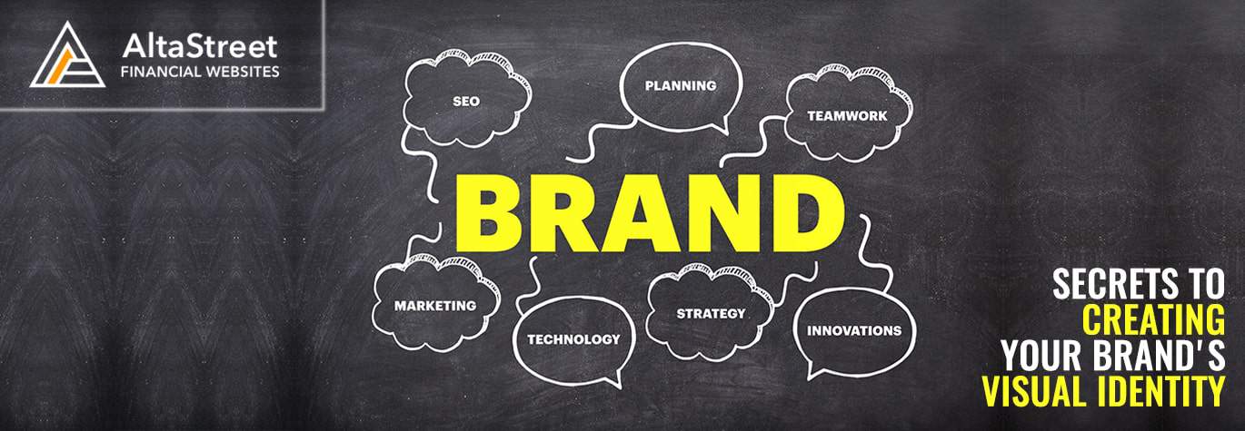
Brand Identity vs. Visual Identity
Brand identity and visual identity go hand in hand, but there are distinct differences between them.
Brand identity is the overall representation of your company to the general public. This includes your visual identity, as well as non-visual elements such as your company name, mission statement, copywriting, messaging, and all other aspects of external communications.
Visual identity strictly deals with logos, colors, graphic design, photos, typography, and all other visual elements that can be seen on your website, social media profiles, business card, and marketing collateral whether it’s on physical or digital media. It’s basically everything that people can see.
Start by Evaluating Your Brand
Before making any design decisions, you need to take a close look at who you are as a brand and who your target market is going to be.
If you want to appeal to a specific demographic, you need to do things that will catch their attention. Flashy graphics and bold colors may work well for younger people, but more conservative individuals may be put off by it, so you’ll have to take a more traditional approach.
Does your current brand image need a complete overhaul, or do you just need to improve on a few things? Either way, your visual identity needs to reflect the brand identity that you want to project.
You also need to take a look at your competitors and figure out how their brand is addressing the market. Find out what they’re doing right if you want to emulate their success, but make sure you’re also making your brand stand out through its own visual identity.
Colors Palettes and Themes
Colors are able to invoke certain moods and feelings in people, so it’s important to choose a palette that is aligned with the brand image you want to present.
For example, red is often associated with strong emotions like love and passion while blue is perceived as cool and calm.
In order to make your brand easily identifiable, you need to consistently use a primary color palette in most of your visual designs – so it needs to be chosen carefully. This primary color palette will be the first thing that people will notice and will be what most people will associate with your brand from here on out.
Keep in mind, you can still use other colors in your designs, but the primary palette should always stand out. Logos, illustrations, photos, and symbols should also complement your primary color palette so your visual identity will have a unified look across all your marketing and promotional materials.
Come up With a Style Guide
To ensure that your visual identity has a consistent look further down the road, you need to establish a style guide or a design language. This will make designing new pages and marketing collaterals in the future much easier since it narrows down the available options your designers can choose from.
A style guide will specifically state what primary and secondary colors to use, the typography you prefer, and other visual elements like logo variations, website buttons, and page layouts.
Brainstorm, Design, Tweak and Redesign
Before finalizing the most important aspects of your visual identity such as colors, logos and key images, make sure it addresses all your branding concerns and speaks to your target audience. Most importantly, it should all look good together since these will be the most used elements in your future designs.
Don’t be afraid to tweak or even completely redesign everything from scratch if anything looks out of place. It’s better to make mistakes now and create different iterations of your brand identity during the design phase than scrapping it all after only one or two years because you’re not happy with the results.
As a financial advisor, one of the most important things you want to project is an image of reliability and trustworthiness. If you’re always completely revamping your visual identity, you’re throwing away any brand equity and trust you’ve already built up previously. People want to see consistency and stability from their favorite brands, so make sure you do it right from the get-go.