How Infographics, Graphs and Charts Can Benefit Your Financial Website Content
A site that’s filled with lots of great content can be informative. But it’s not going to be as interesting, eye-catching, or engaging as one that uses infographics, graphs and charts.
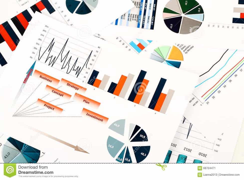
This is especially true when it comes to pages that deal with financial topics and information, which can put many people to sleep. Because it deals with complex concepts, it’s usually text-laden and filled with data that doesn’t look exciting or interesting to the general public.
Breaking things up with an easy-to-read infographic or flow chart provides an alternative way of understanding the important information you’re trying to convey. It will also help engage your readers because it makes the page more interesting to look at.
You’ll also need attractive infographics and charts if you want to repost your content on social media. Having images that can easily illustrate what the numbers and data actually mean are going to get more clicks compared to posts that just have a random but nice looking picture.
Despite the added difficulty involved in creating custom graphics for your content, its benefits cannot be ignored because it makes your content more accessible to a wider range of clients.
What Makes an Attention-Grabbing Graphic
Just because you added a graph or a chart to your page doesn’t automatically make it eye-catching or attention-grabbing.
You still need to consider basic design issues like the color scheme, font choice and backgrounds. All of these need to work together visually if you want to entice your audience to spend their time on your page.
Poor design choices can turn people off which results in a negative impression of your brand. In cases like these, you’re much better off not adding any graphics at all.
The Primary Goal of Adding Graphics and Charts
Your graphics should be easily understandable with just one look. Use clear labels and captions to support your images to help people get a quick high-level overview.
Otherwise, you’re just adding more to the confusion. And your visitors will be scratching their heads trying to figure out just what it is they’re looking at.
Most important of all, make sure your infographics and charts can illustrate a point completely. You don’t want to have graphics that only contain half the information necessary and don’t give a complete picture of an idea or concept.
What Information Translates Well Into Charts or Graphs
For financial companies, it makes sense to turn lots of numbers, trends, or other measurable figures into a chart or graph. But just because you have some data doesn’t mean you should turn that into a chart.
You need to consider whether or not that data is integral to the main topic, or at least the sub-topic, that’s being discussed. You can also turn data that reveals something extremely interesting or eye-opening into a chart, as long as it drives home the point that you’re making.
If the numbers and charts are only there to support a minor detail, you’re just wasting screen real estate. Remember to prioritize things that are actually of interest to clients or potential customers.
How to Easily Create Attractive Infographics, Charts and Graphs
You can easily create different types of graphs and charts using spreadsheets like Excel of Google Sheets.
But if you want to make it more unique and interesting, you’ll have more design options using graphic design tools like:
-
-
- Canva
- Piktochart
- Easelly
- Infogram
-
These tools not only give you more design options, but also allow you to easily create infographics which are extremely popular and trendy, especially on social media.
AltaStreet can help you transform your financial website into something that is beautiful, functional and engaging.
With our expertise in financial services and web design, we can help your business reach its goals.
Contact us today using the contact form below.